When branding comes together

New marketing direction for global TEFL company
June 9, 2014
14 years in business!
January 27, 2016When branding comes together
I developed a great brand for a global TEFL company this year – tefl247. And we decided to introduce new products, along with sub-brands, it was really exciting to see them working alongside the master brand.
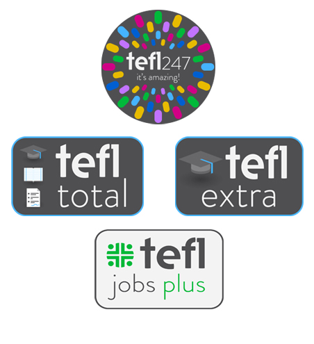
Looking to develop the online course area of the business, two training packages were introduced – tefl total and tefl extra. Their brands are different in their own right, whilst still retaining looks of the main logo including colours and typography.
Later in the year the jobs area of the business was developed to include tefl jobs plus. Again, the brand for this also feels the same as the main logo, whilst having its own identity.
And when you look at them all together, it’s a great example of brand unity. I think they look amazing. Visit www.tefl247.com and see what you think.


